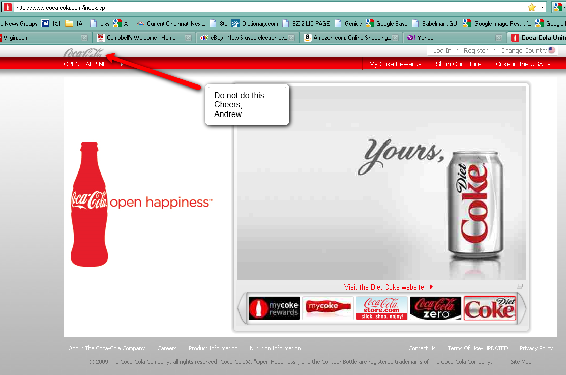
Don’t Make The Same Mistake Coke Did!
Click On Image To See Full Size
OK, so I woke up at 3:30 AM this morning and decided I might as well get some work done as I knew I was not going to be able to get back to sleep. Have a couple of issues to solve and my noodle just would not shut off. Upside is I think I solved most of them in the peace and quite of the morning.
Anyway, in my research, I went to the Coke.com or Coca-Cola fame site.
And found a glaring error on their main website for the US of A.
Please note they playing peek a boo with their Logo, which as a brand is worth Billions of Dollars… Arghhhhhh
Now this could happen to anyone of us which is why I am bringing up this point, but, for a Multi-Billion dollar company to have this on their site for at least 8 hours or more?
Come on people. My point is to make sure you check your site in different browsers. This was on Windows using the latest version of Firefox.
Now I don’t want to beat up whomever is running their Websites but, you have to watch this so that that are glaring errors like this on your site and look not so Kewl as it were. Again, I have done things like this, and while Coke can afford to do silly things like this, if you are having first time visitors come to your site and you turn them off by doing things like this, they probably will look at everything you say with a very skeptic eye and may not buy from you.
In other words, you can’t afford to do things like this.
And just for full disclosure, I have done things like this before myself. Recently I had not tested the contact page, and there was a 404 error due to a software conflict. Who knows how long that was going on for……
So the lesson here is to go through and test your site once a week or pay an assistant to do so. Make it part of your routine. Kind of like checking the oil and tire pressure on your truck that is making you money everyday.
Normally I would say be like Coke, they are a great company and brand, but in this case, definitely do not do what Coke did.
So, check your site in a variety of browsers, and if you don’t have a Mac, find someone that does and have them do the same. Make sure your site looks like it was supposed to, even if it is not a suave multi-million dollar design. Just make sure the parts go where they are supposed to go.
I have seen this on a couple of other sites recently too. Plus, where in the heck do you go on this site? I am not super fond of their layout from a marketing standpoint. What do you think?
Cheers,
Andrew
PS I am curious to see how long it will take for them to catch this…. And I am a nice guy, I did try and call them 3 times this morning to speak with someone using the 800 number listed in their contact section but I could never get an answer. Yet another lesson that Coke is teaching us. Make sure people can get in touch with you. Forget that they might want to purchase something from you, they might just be trying to save your bacon… or at least be trying to help you out. LOL Just something else you have to watch out for.
